Monday, October 31, 2011

BOO! Segreto Book is Scary Sophisticated & ColorMix in Miami!

Scary Sophisticated Designs & ColorMix in Miami:
Every now and then I am reminded why I love what I do.  Leslie Sinclair recently helped me remember with her new book: http://segretofinishes.com/the-book.html

Boo!
But before, we get too serious, here is my recommendation for a really good Halloween Movie:


Back to Leslie's Book:
The incredible images below speak for themselves...


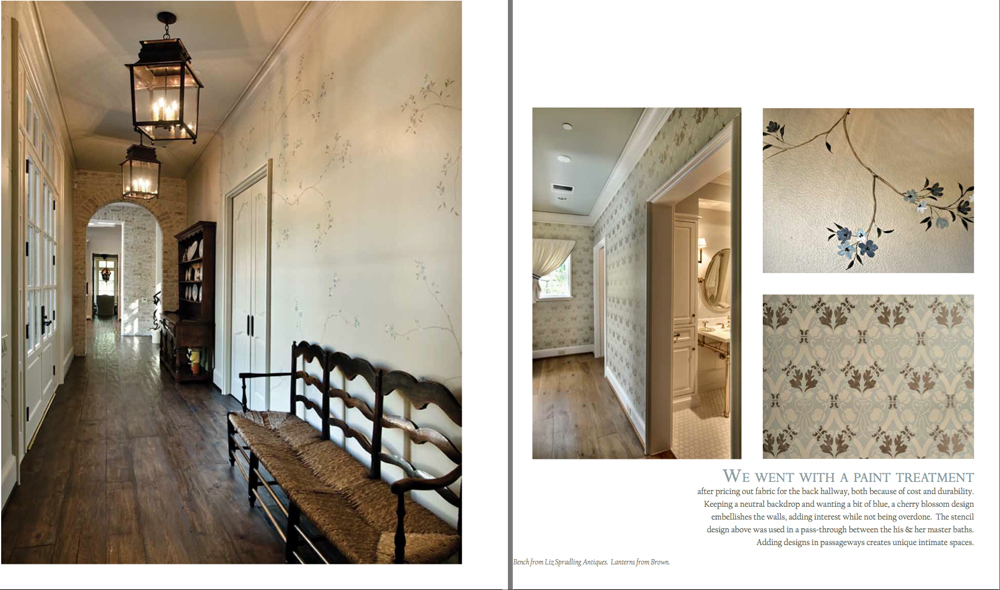
Do you get the idea?!  Remember why you decided to get into decorative painting?!...

Leslie's incredible talent is quietly evident in all of her interiors. (This is NOT the Attack of the Sponge or a how-to book with page after page of over-the-top Faux!)

I had the pleasure of getting to speak with Leslie on a recent phone interview.  She was busy running from client meeting to jobsite, but took the tme to talk.  As we spoke, I realized that we had a lot in common related to how we approached interiors and working with interior designers and clients. Leslie, said that her decorative finishes, "Showcase the architecture and design and hopefully provide a warm, wonderful feeling for my clients." 

Leslie, has worked hard over the years to hand pick and train her painters how to replicate her designs.  She has a small army of artists and highly trained and coached, talented painters.  Hard work and customer care along with her amazing sense of design is keeping her business booming in a tough economy. She is ALL ABOUT Customer Service.  She keeps her opinions to herself and focuses on the vision of the client.  (Every so often she has to gently guide a client away from disaster)

Speaking with Leslie was a treat and I hope to be able to work with her in the future on upcoming projects with Faux Impressions. 

Thanks Leslie for your inspiration and direction!

The world of decorative painting is limitless, ever-changing and richly complex. Finishes for walls, ceilings, floors and cabinetry are crucial to the embodiment of a home's character. Segreto Finishes’ niche in the world of design motivates owner Leslie Sinclair to constantly explore new techniques and finishes that appeal to a vast multitude of styles and personal tastes.

Leslie lives by the philosophy that upon entering a room, your eyes should not draw a distinction to one element or finish but should see the surroundings as a whole. By developing a palette that complements a home’s architecture and design, surroundings are given a new perspective.
Graduating from the University of Texas with a business degree, Leslie left her corporate job in 1995 to start Segreto Finishes, naming the company after her husband's family. Segreto, which means secret in Italian, rolls up all of Leslie's passions — architecture, interior design, art, people and business-- into her idea of the perfect job. Leslie's talent for color, bringing innovative products to Houston, hiring and training a quality staff and working with people on their individual needs, built Segreto' s reputation.
With a staff of 25 artisans, the company has become a premier finish design firm with work featured in numerous publications including Veranda, Traditional Home, House Beautiful, Country French, Elegant Homes, Beautiful Homes and Beautiful Baths, to name a few. Leslie also regularly contributes to Antique Shops and Designers magazine.
Inspired by all aspects of artistic painting, she owns an art gallery, Segreto Studios, and writes a blog, Secrets of Segreto, about interiors, art and finishes. Her first book Segreto: The Secrets to Finishing Beautiful Interiors, a wonderful reference book for anyone interested in home design can be purchased [here], various [Houston Antique stores] or through Amazon.com. Leslie, along with her husband and three children, resides in Houston, TX.
See the link below for details and scheduled events near you.


Jackie Jordan the Director of color Marketing for Sherwin-Williams and her team have put together yet again the industry's best and most comprehensive color and design trend presentation.  This inspirational journey takes you from the design influences of Milan and Paris to fashion runways of NY and LA to creative design and architecture to the influences that surround us by Mother Earth itself!

Design and Color Trends, Inspiration, Jackie Jordan, Interiors Designers and Decorative Artists all together for inspiration and networking...  Don't Miss it!


ColorMix Preview, featured on RSVP Design Services Blog:

Aislinn Phelan, Rhonda Vandiver-White and Amy ArmstrongThroughout the 2012 Color Forecast presentation, the main colors mentioned were blues, greens, neutrals and reds.

2012 Color Forecast
According to the Sherwin-Williams website, “The blues consist of a soothing palette celebrates a pair of functional and treasured blues: denim and water. It explores the darkest indigo to faded-jeans hues, some with violet undertones, as well as the calm, shimmery shades that reflect rivers, lakes and seas.”   Some fantastic examples of blues are the royal wedding, Netherlands floating apartment complex, Richard Ginori china, and of course the planet earth!

Kate Middleton in Blue!

Netherlands Floating Apartment Complex

Richard Ginori Fine China

Planet Earth
Here is a great video from Sherwin-Williams on the blue hues!
http://www.youtube.com/watch?v=rtM4rx7kG3Q&feature=related
According to the Sherwin-Williams website, “Casting aside the more innocent yellow-tinged greens of the past, this eclectic palette focuses on greens that are lush, moody and complex. It showcases the depths of the sea and forest; leafy motifs; rustic natural textures; and organic elements such as algae, moss and seaweed.”  Some fantastic example of greens are algae, an Amsterdam Boutique Hotel, “Land Carpet”, and a Kartell Victoria Ghost Chair by Philippe Starck.

Algae

Amsterdam Boutique Hotel

"Land Carpet"

Kartell Victoria Ghost Chair by Philippe Starck
Here is a great video from Sherwin-Williams on the green hues!
http://www.youtube.com/watch?v=7M6enTeOhNw&feature=related
According to the Sherwin-Williams website,  ”Raw materials continue to influence color trends, especially the more subtle hues. Picture a field of grain, pile of pebbles, weathered wood and earthen clay. Gold tones embody the sun and soft metallics — and warm up this understated yet refined palette. Textural elements, such as linen, unfired porcelain and mixed woods, provide subtle tonal variations.”  Some fantastic examples of neutrals are linen, cork, Weitzner Limited Oracle natural wallcovering, and grain.

Linen

Cork Chair

Weitzner Limited Oracle Natural Wallcovering

Grain
Here is a great video from Sherwin-Williams on the neutral hues!
http://www.youtube.com/watch?v=BEPy7u7hRXw&feature=related
According to the Sherwin-Williams website, ” Red is the color of love, fire and the earth’s molten core, and it stirs raw emotions ranging from the deepest passion to the softest femininity. This saturated palette includes hues of brilliant flowers and glowing embers. It isn’t a single red, but a deep gradation of fuchsias, red-oranges, violets and delicate pinks.”  Some fantastic examples of reds are a Marion Rose piece of Art, a red gerber daisy, red/pink boutique room, and red lipstick.

Marion Rose Artwork

Red Gerber Daisy

Boutique Room

Red Lipstick
Here is a great video from Sherwin-Williams on the red hues!
http://www.youtube.com/watch?v=o6hS292mS24&feature=related
 
2012 Colormix by Sherwin Williams
I hope to see you soon!

Thanks

Ed

@FauxImpressions on Twitter


Information on IDAL at:


Segreto: Secrets to Finishing Beautiful Interiors.

Monday, October 24, 2011

Proper Metallic Roller Application


For more details go to www.swfaux.com

Metallics Roller Applied:
It is important to fully seal new drywall with one of Sherwin-Williams premium latex primers.  apply 2 coats of the specified base paint in ProMar 200 ZERO VOPC eggshell paint or Duration home Matte paint.  Allow to fully dry.

Next apply a generous application of Faux Impressions, Metallic using a 6" x 1/2" microfiber mini roller sleeve and a 9" x 9/16" microfiber roller sleeve.  Use the mini roller to get into ceiling, baseboards lines and corners.  Pull out of the corners in random curving motions.  (Random curving "X's")  As you get away from the corners you can switch to the 9" roller frame and handle and continue with the random roll application, blending and working across and down the wall.

Always maintain a wet edge and "Go HJeavy or Go Home!" in your application.  (300 sq ft to a gallon)  One person or a team can roll the product on regularly as long as another person or team comes behind and backrolls using the mini and 9" microfiber rollers, fully loaded, breaking up the "straight up-and-down rolled" pattern with the random motions.  Again, do NOT backroll with a dry roller.  This type of "wet" and generous application allows for the metallic to flow and level and "melt" to the nearly sprayed appearance.

Spraying:
You can spray through and airless or an air assist unit as long as you take the filters out of the hose and the gun and use a fine finishing tip and approx 2000 psi.

The Faux Impressions Metallic is about as durable as semi gloss paint.  For additional durability, apply a coat of Sher-Clear 1K semi gloss water based poly.

For custom Metallic colors, contact your local Sherwin-Williams delaer.  They will be able to mix your custom color using a 20% paint formula.  Simply paint the wall your chosen color and apply the 20% tinted metallic.  Create a sample board for final visual effect prior to paint a wall or room.

For more installation information contact Ed Mattingly at ed@mattinglynolimitspaint.com


Thanks

Ed

@FauxImpressions on Twitter


Information on IDAL at:

Wednesday, October 5, 2011

BIGGER in TEXAS & 343 Dresses!!?

Design Inspiration combined with
networking between interior designers and decorative artists/contractors...

Now that's good time management!!!

I have been busy presenting our Faux Impressions product line during our current ColorMix 2012, nationwide blitz to interior designers and architects. These events have turned out to be not only incredibly eye-opening and inspirational for attendees, but have also begun to connect specifiers of decorative finishes with installers of those same finishes.

If you are an interior designer looking for an installer or an installer looking for jobs leads through interior designers, you should mark your calendars and bring
lots of business cards! 


Dot + Dot + Dot = $$ and happy clients! (. + . + ...  )
Quite often, I will meet a designer and refer them to a trusted resource in their market, but recently at our ColorMix Events, I have been able to actually introduce them face-to-face at my Faux Impressions table.  It is also important to be certain that the installer is connected to a sales rep and servicing local store. We can work together to connect all of the dots.
(Dot connected to dot connected to dot,
ensuring a successful experience at 3000 stores nationwide!)


ColorMix Preview:
Check the bottom of this post for a quick peek at slides from ColorMix 2012,
recently featured on a design blog!


Design Center Inspiration:
I have been fortunate enough the past couple of weeks to be conducting my presentations in various design centers.  I LOVE seeing the newest fabrics and various design trends in the many showrooms and display windows.

I saw the unexpected in a corner exhibit at the Pacific Design Center in Los Angeles...
343 Dresses, in progress. 

More details below...

Segreto:
I also saw an amazing book by Leslie Sinclair.  I will have more to share with you in my next blog post.


Segreto: Secrets to Finishing Beautiful Interiors


See Jackie Jordan holding the book open to her favorite room setting.  This book is packed from page to page with some of the most sophisticated room and finishes that I have seen in ages!


Back to The ColorMix Design Center Tour:


San Francisco Design Center ColorMix

Jackie Jordan and Stephanie Letsinger presented to over 100 interior designers.

. + . + ...  I connected a lot of dots at my table!
IDAL members in attendance handed out cards!


The Buzz Before


Robert Allen/Beacon Hill Showroom and SW Color Center


Down to Los Angeles and the PDC

Karen Galvin and Jackie Jordan presented to over 100 interior designers.


Beautiful textural art with Metallics

ColorMix in session at the PDC


Standing room only... DOGS Welcomed!


Over to Houston and the Decorative Center


Nubia Heinz and Jackie Jordan presented to 200 designers!

. + . + ...  I connected a lot of dots at my table!


Los Angeles had a health club at their design center,
Houston has a groovy Bar!


Over to DALLAS TX!!! 250 +
Ashlynn Bourque and Jackie Jordan presented to 250+ interior designers,
standing, sitting, leaning, etc.!

My Faux Table was SWAMPED.
 . + . + ...   Yes more connecting! 

I even referred a project to an IDAL member for a designer with a project in Florida

What a blast! 

I have learned to juggle multiple sample boards
and multiple questions at the same time!

Just for fun, we through in some serious hands-on sessions along the way.

The South West Division of Sherwin Williams has it going on!

A Special Thanks to our Faux Impressions Teams in San Francsico, Los Angeles, Houston and of course DALLAS!


343 Dresses at PDC


343 Dresses: The Chromatic Convergence Project by Mary Younakof
343 Dresses: The Chromatic Convergence Project is an interactive art piece that uses color to explore and engage the sprawling Los Angeles metropolis.

Central to this project is a dress design that the artist has created and made into 343 separate dresses, each having a different color. The project is based on the number seven: the dress itself is comprised of seven pieces and the color palette ...is based upon seven colors; red, orange, yellow, green, blue, indigo and violet (ROYGBIV).

Central to this project is a dress design that the artist has created and made into 343 separate dresses, each having a different color. The project is based on the number seven: the dress itself is comprised of seven pieces and the color palette ...is based upon seven colors; red, orange, yellow, green, blue, indigo and violet (ROYGBIV).

The seven colors will extend exponentially into 49 tones equating to total 343 dresses. While the central body of work in this project is the dresses, the dresses only serve to activate a larger art project that includes video, photography, performance, sculpture, installation and interactive art.

The performative aspect of this project will be an ongoing process where the artist wears a different dress each day over the course of 343 days. Each week the artist will do a performance in selected locations throughout the city that match the color of the dress she is wearing that day.

These happenings will be recorded and posted on the Internet for viewing. The project also makes use of social networks to invite the public to virtually follow, view and interact with the project as it progresses. The project will grow in scope as it continues to unfold over the course of a year.The seven colors will extend exponentially into 49 tones equating to total 343 dresses. While the central body of work in this project is the dresses, the dresses only serve to activate a larger art project that includes video, photography, performance, sculpture, installation and interactive art.The seven colors will extend exponentially into 49 tones equating to total 343 dresses. While the central body of work in this project is the dresses, the dresses only serve to activate a larger art project that includes video, photography, performance, sculpture, installation and interactive art.The seven colors will extend exponentially into 49 tones equating to total 343 dresses. While the central body of work in this project is the dresses, the dresses only serve to activate a larger art project that includes video, photography, performance, sculpture, installation and interactive art.


ColorMix Preview, featured on RSVP Design Services Blog:

Aislinn Phelan, Rhonda Vandiver-White and Amy ArmstrongThroughout the 2012 Color Forecast presentation, the main colors mentioned were blues, greens, neutrals and reds.

2012 Color Forecast
According to the Sherwin-Williams website, “The blues consist of a soothing palette celebrates a pair of functional and treasured blues: denim and water. It explores the darkest indigo to faded-jeans hues, some with violet undertones, as well as the calm, shimmery shades that reflect rivers, lakes and seas.”   Some fantastic examples of blues are the royal wedding, Netherlands floating apartment complex, Richard Ginori china, and of course the planet earth!

Kate Middleton in Blue!

Netherlands Floating Apartment Complex

Richard Ginori Fine China

Planet Earth
Here is a great video from Sherwin-Williams on the blue hues!
http://www.youtube.com/watch?v=rtM4rx7kG3Q&feature=related
According to the Sherwin-Williams website, “Casting aside the more innocent yellow-tinged greens of the past, this eclectic palette focuses on greens that are lush, moody and complex. It showcases the depths of the sea and forest; leafy motifs; rustic natural textures; and organic elements such as algae, moss and seaweed.”  Some fantastic example of greens are algae, an Amsterdam Boutique Hotel, “Land Carpet”, and a Kartell Victoria Ghost Chair by Philippe Starck.

Algae

Amsterdam Boutique Hotel

"Land Carpet"

Kartell Victoria Ghost Chair by Philippe Starck
Here is a great video from Sherwin-Williams on the green hues!
http://www.youtube.com/watch?v=7M6enTeOhNw&feature=related
According to the Sherwin-Williams website,  ”Raw materials continue to influence color trends, especially the more subtle hues. Picture a field of grain, pile of pebbles, weathered wood and earthen clay. Gold tones embody the sun and soft metallics — and warm up this understated yet refined palette. Textural elements, such as linen, unfired porcelain and mixed woods, provide subtle tonal variations.”  Some fantastic examples of neutrals are linen, cork, Weitzner Limited Oracle natural wallcovering, and grain.

Linen

Cork Chair

Weitzner Limited Oracle Natural Wallcovering

Grain
Here is a great video from Sherwin-Williams on the neutral hues!
http://www.youtube.com/watch?v=BEPy7u7hRXw&feature=related
According to the Sherwin-Williams website, ” Red is the color of love, fire and the earth’s molten core, and it stirs raw emotions ranging from the deepest passion to the softest femininity. This saturated palette includes hues of brilliant flowers and glowing embers. It isn’t a single red, but a deep gradation of fuchsias, red-oranges, violets and delicate pinks.”  Some fantastic examples of reds are a Marion Rose piece of Art, a red gerber daisy, red/pink boutique room, and red lipstick.

Marion Rose Artwork

Red Gerber Daisy

Boutique Room

Red Lipstick
Here is a great video from Sherwin-Williams on the red hues!
http://www.youtube.com/watch?v=o6hS292mS24&feature=related
 
2012 Colormix by Sherwin Williams
I hope to see you soon!

Thanks

Ed

@FauxImpressions on Twitter


Information on IDAL at:


. + . + ...  I connected a lot of dots at my table!